Composition
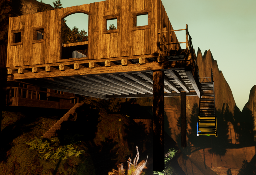
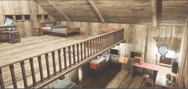
When building the cabin I paid attention to the underside of it to make it realistic by adding support beams under the floor.
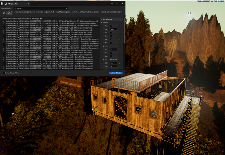
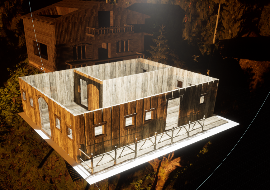
After building the cabin out of the modular medieval building pack I merged it into one object using the merge actors function.
I changed the size of the cabin to make the interior look less massive.
When I first furnished the cabin there was lots of empty space so I scaled the cabin down to make it look more filled and less like a luxurious home.
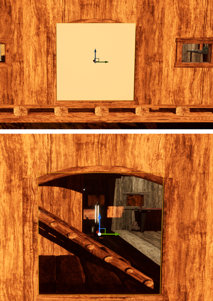
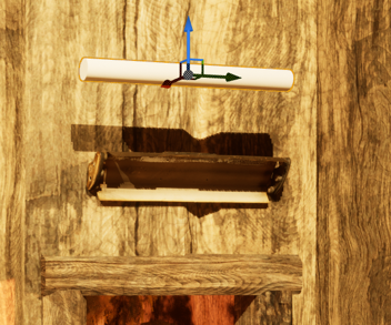
I added glass to the large window I made using a door frame by scaling a cube actor and changing its material.
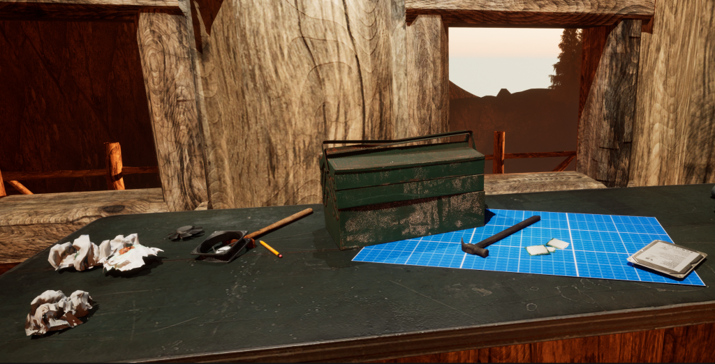
When adding clutter to the desks I created curves with the height of the assets I placed next to each other so the composition would flow.
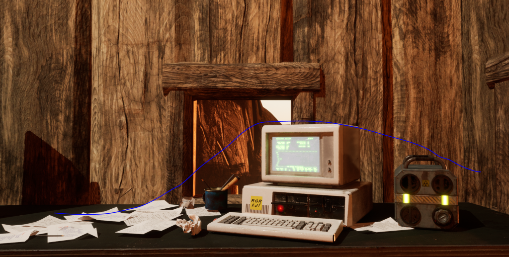
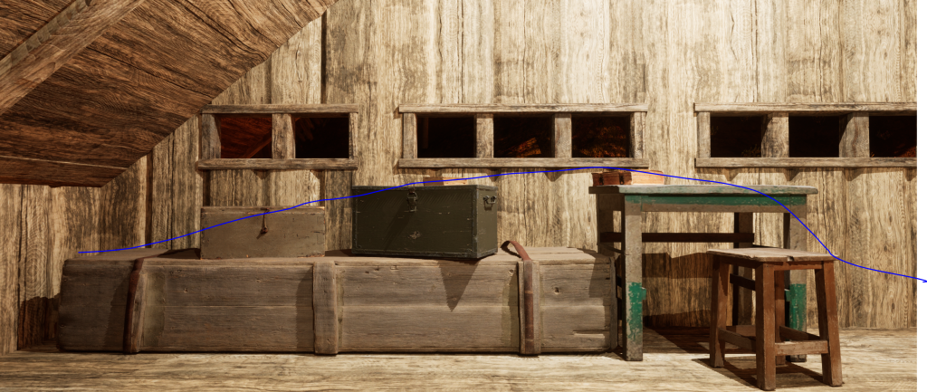
In beauty shots I used the rule of thirds to compose the placement of my assets in frame.
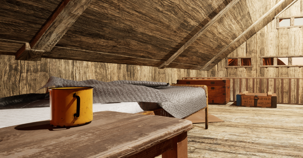
In this shot I use the rule of thirds and leading lines to inform the composition. The line of the bed leads between the mug and the crates at the end of it. The mug and the blue crate are placed on the corners where the thirds meet making them focal points and the line leading between them draws the eye from one to the other.
Colour
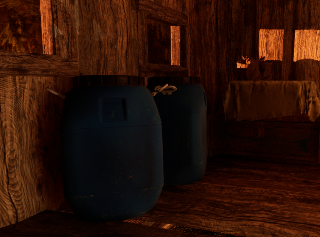
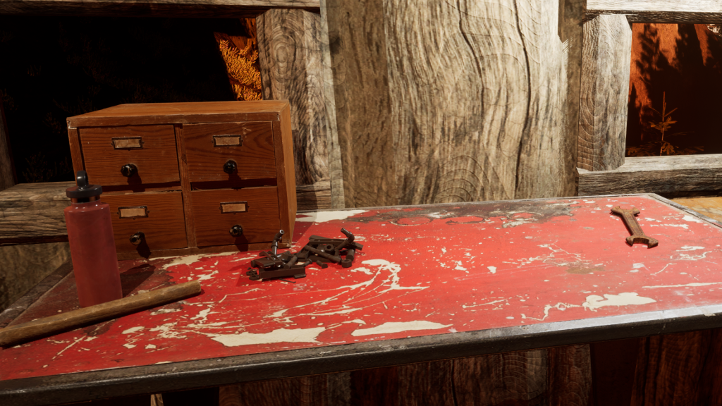
When choosing assets I kept mostly to brown, grey, dull green or desaturated colours to keep the dystopian apocalyptic feel of the theme with the exception of a few pops of colour like the red metal workbench and the blue table and barrels. The pops of colour in my environment are all primary colours, I did this to keep the colour pallet simple and prevent the use of colour from looking messy and chaotic. This also helps my asset pop against the environment as its contrasting colours make it looks like its the brightest thing in my environment.
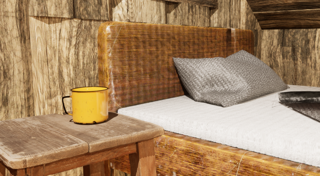
This yellow mug is the only yellow object in my environment and it works well to break up the browns, greens and greys of the bedroom. It makes a good focal point for my beauty shot and video where I’ve aligned it with the rule of thirds.
Lighting
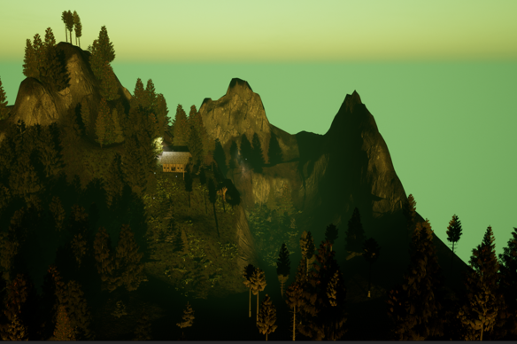
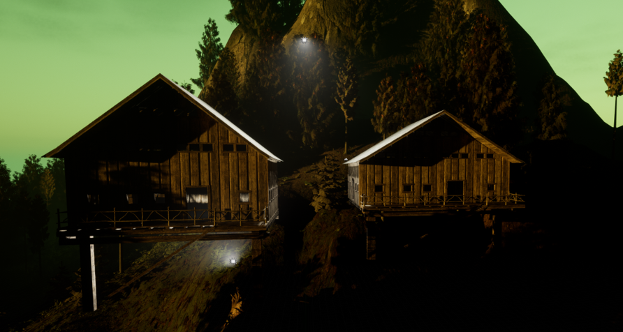
I ended up switching my lighting from my original plan of a cool toned exterior and a warm interior to a warm yellow sunset exterior lighting and cool white lighting indoors. I made this change as the directional light looked best at a low angle; the shadows it cast and ray effects make the landscape look less flat and more real.
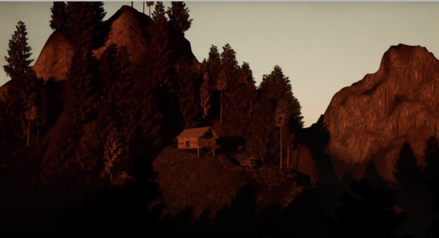
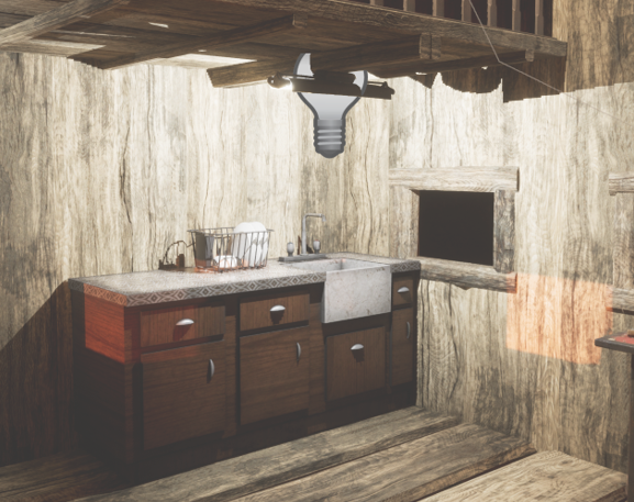
The final lighting on the outside landscape is warm and red toned. Its on the border between natural and unnatural which, I think, works well for creating the dystopian feels in the environment. It contrasts the cool clinical lighting for the interior of the cabin which demonstrates the difference between the natural world and the sci-fi tech inside the cabin.
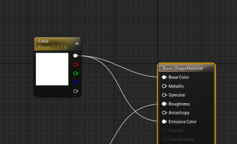
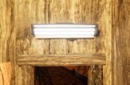
I made fluorescent tubes for this light by plugging its materials base colour into its emissive colour. However this light didnt affect the environment so I later added a lengthened point light on top of them.
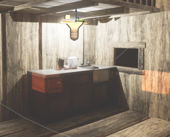
Due to switching to cool white lights on the interior of the cabin I had to reduce the intensity and attenuation radius of the point lights to prevent them from washing out the colour of the objects in the interior and making the textures appear flat.
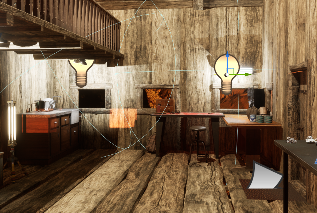
I also has to adjust the positioning of some lights to reduce the large shadows they were casting.